Website - kriyasakthi

Wellness & empowerment services, individual and corporates.

Wellness & empowerment services, individual and corporates.

Wellness & empowerment services, individual and corporates.

Kriyasakthi is a holistic wellness provider offering individual counseling, therapy, and corporate services to enhance emotional well-being and empowerment.

01 - design Style

The visual approach that shaped the product

The visual approach that shaped the product

Earthy

The website utilizes a deep emerald green and warm cream/beige palette, conveying both professionalism and a holistic approach.

The website utilizes a deep emerald green and warm cream/beige palette, conveying both professionalism & a holistic approach.

Structured

Information is presented in a highly organized layout using distinct sections and card designs for quick, easy navigation.

Blended

The visual identity mixes professional photography (e.g., therapists) with modern, stylized illustrations (e.g., wellness activities)

The visual identity mixes professional photos (eg. therapists) with modern, stylized illustrations (eg. wellness activities)

02 - typeface

Martel

The Martel serif typeface is an excellent choice for a counseling website's headings due to its trustworthy yet friendly readability. Its high-contrast, traditional style lends an air of credibility, establishment, and informed depth to titles, which is crucial for building client confidence.

abcdefghijklmnopqrstuvwxyz

abcdefghijklmnopqrstuvwxyz

1234567890!@#$%^&*()

Regular

Semibold

Bold

Aa

Aa

Aa

karla

The Martel serif typeface is an excellent choice for a counseling website's headings due to its trustworthy yet friendly readability. Its high-contrast, traditional style lends an air of credibility, establishment, and informed depth to titles, which is crucial for building client confidence.

abcdefghijklmnopqrstuvwxyz

abcdefghijklmnopqrstuvwxyz

1234567890!@#$%^&*()

Regular

Semibold

Bold

Aa

Aa

Aa

03 - Color

A palette tuned for tone,

hierarchy, and trust.

A palette tuned for tone, hierarchy, and trust.

Jonquil

F6C916

Primary Color

Eerie Black

#212529

Neutral Color

White

#FFFFFF

Neutral Color

Linen

#F9F1E8

Secondary

#356D3E

#014D43

Gradient

#014D43, #356D3E

#014D43,

#356D3E

04 - HIGHLIGHTS

Clarity at first scroll

Clarity at first scroll

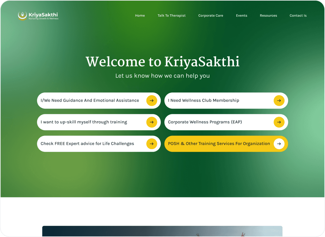
Main choices after immediately visible and labeled with unambiguous, user-centric language - so visitors know exactly what’s on offer.

Affordant, confident CTAs

Affordant, confident CTAs

Large, contrasting, arrow-adorned buttons clearly signal that they are clickable interactive elements — driving conversion without feeling pushy.

05 - PROBLEM SOLVING
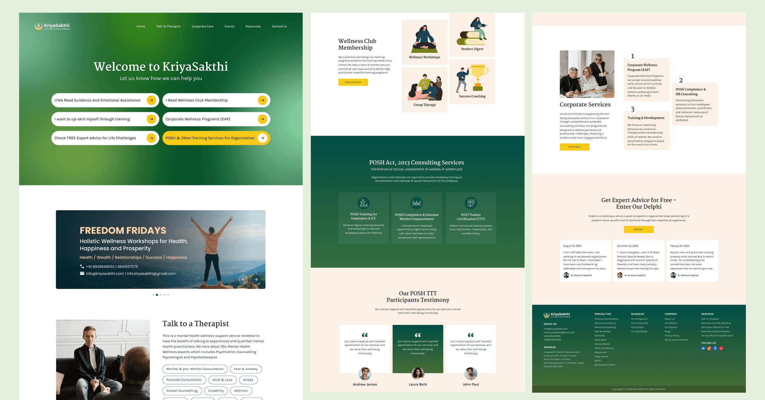
Decisions that shaped the final experience.

Decisions that shaped the final experience.

PROBLEM - 01

A palette tuned for tone,

hierarchy, and trust.

A palette tuned for tone, hierarchy, and trust.

A palette tuned for tone, hierarchy, and trust.

Six prominent, high-contrast yellow CTAs are placed directly under the hero — each labeled in plain user language ('I need Guidance', 'Wellness Club', 'Corporate Wellness'). Visitors immediately know what is on offer without having to read paragraphs or hunt through the navigation.

PROBLEM - 02

Abstract services, made tangible.

Abstract services, made tangible.

Wellness, therapy, and coaching are intangible — so they are illustrated with warm, character-led artwork on a soft beige canvas. The visual metaphors make each service feel approachable and reduce hesitation for first-time visitors.

Wellness, therapy, and coaching are intangible — so they are illustrated with warm, character-led artwork on a soft beige canvas. The visual metaphors make each service feel approachable and reduce hesitation for first-time visitors.

PROBLEM - 03

Hierarchy through color-coded blocks.

Hierarchy through color-coded blocks.

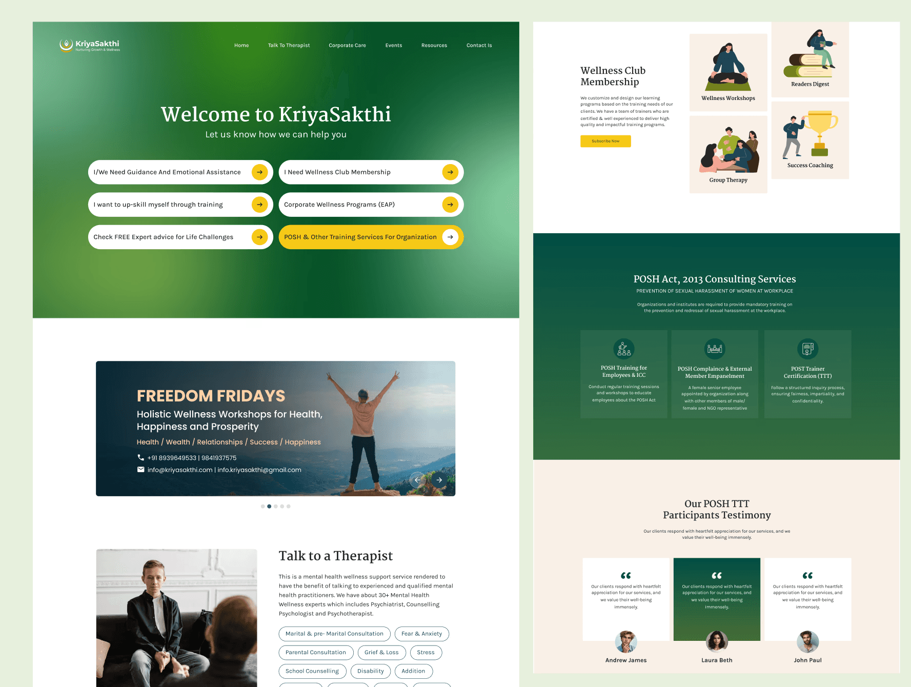
The page is segmented into distinct horizontal bands — deep emerald for compliance services, beige for therapy, white for corporate. Color carries the structure, so users feel the shift between sections before they read a single word.

PROBLEM - 04

Simplifying Corporate Wellness Solutions

Simplifying Corporate Wellness Solutions

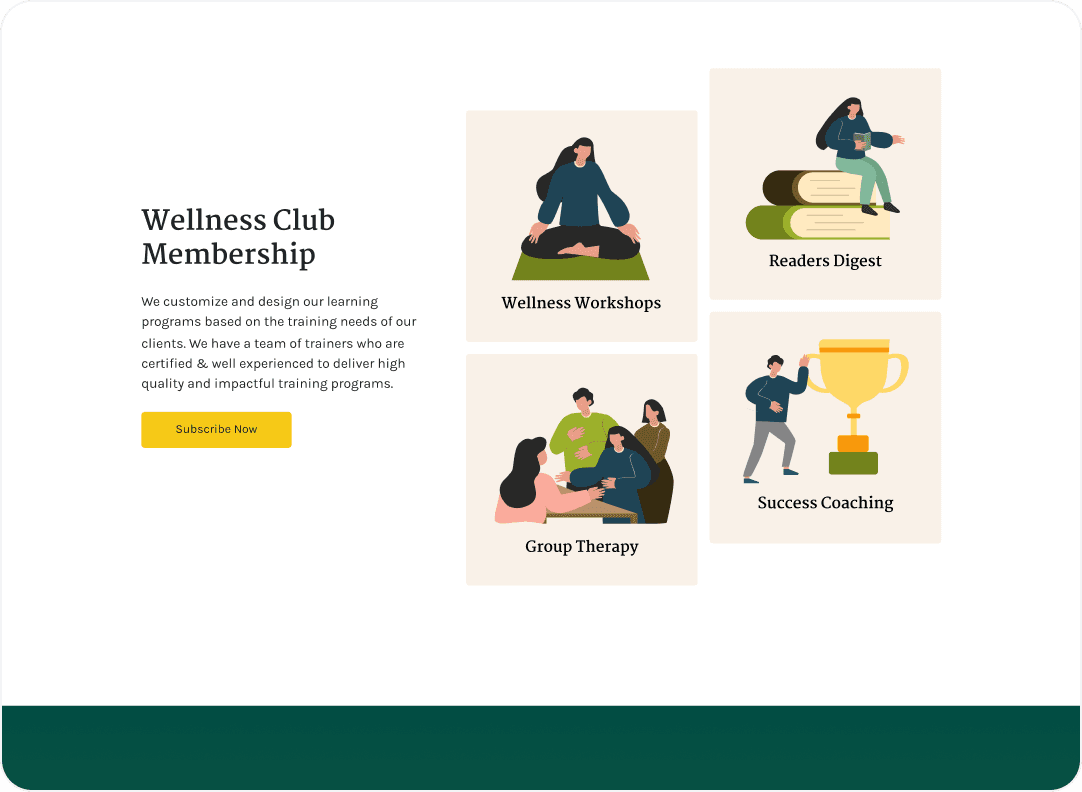
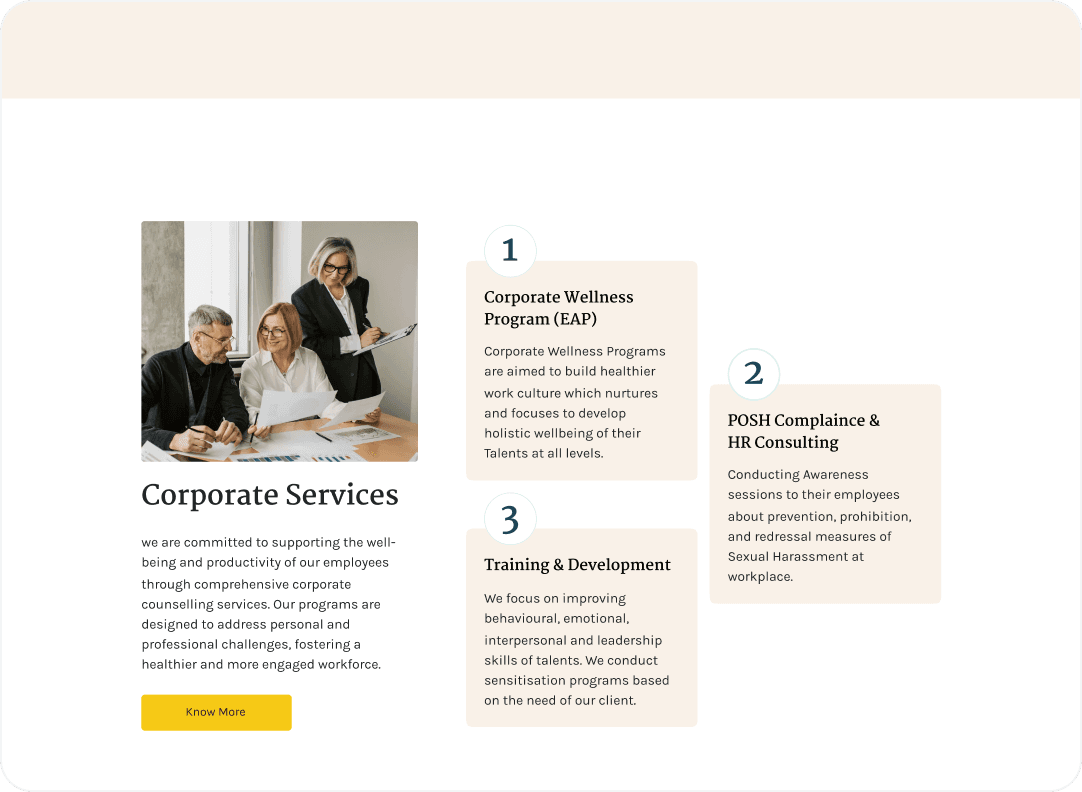
This section organizes multiple corporate services into a clear, easy-to-scan format, helping visitors quickly understand the available offerings. By presenting key services with concise descriptions and visual hierarchy, it reduces information overload and improves comprehension.

PROBLEM - 05

A low-friction path to first contact.

A low-friction path to first contact.

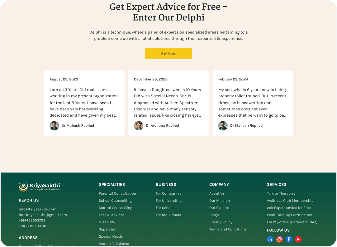
The Delphi panel turns the scariest moment — reaching out — into a casual read. Real questions, real expert replies, and a single calm yellow 'Ask Now' button give hesitant visitors an obvious next step with zero commitment.

#6 — Next

Let's build something

thoughtful together.

#6 — Next

Let's build something

thoughtful together.

#6 — Next

Let's build something

thoughtful together.

Start a project

Back to work

Prashanth K P

UI/UX Designer • Crafting calm interfaces

LINKEDIN

EMAIL

BACK TO TOP

© 2024 Prashanth K P. All rights reserved.

Designed & Built in Chennai.

Prashanth K P

UI/UX Designer • Crafting calm interfaces

LINKEDIN

EMAIL

BACK TO TOP

© 2024 Prashanth K P. All rights reserved.

Designed & Built in Chennai.

Prashanth K P

UI/UX Designer • Crafting calm interfaces

LINKEDIN

EMAIL

BACK TO TOP

© 2024 Prashanth K P. All rights reserved.

Designed & Built in Chennai.